The humble, overlooked, infinitely accessible browser provides the stage — if the game loads in two seconds, teaches itself through its first gesture, and stays under five megabytes.
A player taps a link in a group chat. The browser opens. A white screen appears. One second. Two seconds. At three seconds, 38% of them are gone — back to the conversation, scrolling past, already forgetting what they clicked. At five seconds, over a third of the survivors leave too. For a game that lives or dies on viral sharing, where every play session begins as someone’s impulsive tap on a friend’s result card, load time is not a performance metric. It is the game’s front door, and every second it stays shut costs a third of the audience standing outside.
The data from Pingdom and Google’s web performance research is unambiguous: pages loading within two seconds hold a 9% bounce rate. At three seconds that number roughly doubles. At five seconds it quadruples. Chicken Road, the browser game that reached 42 million sessions in late 2025 with essentially zero advertising budget, treated this reality as its founding constraint. Total payload: under five megabytes. The game’s first interactive frame arrived almost instantly, with additional assets streaming in the background while the player was already hopping.
The architectural pattern behind this is progressive loading — a disciplined separation of the game into a tiny “shell” (controls, first-frame visuals, core logic) and deferred “enrichment” (sound effects, particle systems, secondary UI). The game loop begins the moment the URL finishes resolving. Everything else catches up while the player is already engaged. For a competitive AI-vs-human game, this means the first swipe or tap must be possible within two seconds, even if the AI opponent’s full visual identity is still loading in the background.
Conventional UX wisdom says skeleton screens — those grey placeholder rectangles that mimic the page layout — make loading feel faster. Viget’s 2025 study of 136 participants found the opposite. Skeleton screens performed worst across every metric, with only 59% of participants agreeing the page loaded quickly compared to 74% for a simple spinner. Average perceived wait time with skeletons: 2.82 seconds. With spinners: 2.41 seconds.
Skeleton screens backfire for unfamiliar interfaces. In Viget’s study, a simple spinner outperformed skeleton screens on every perceived-speed metric.
The researchers’ hypothesis is revealing: skeleton screens “attract more attention” in interfaces users have never seen before. When you load Gmail, a skeleton screen works because your brain fills the grey rectangles with the inbox you already know is coming. When you load a brand-new game you have never played, the skeleton shows you nothing recognizable — it just makes you stare at emptiness, more aware of every passing millisecond. For a viral game where most visitors are first-time players arriving from a social media link, a brief animated loading indicator themed to the game’s visual identity will outperform the “sophisticated” approach.
Low-poly art was supposed to be the safe bet. Dozens of trend pieces in 2025 crowned it the dominant aesthetic of indie game design — “modern-day cubism,” as one commentator called it, pairing simple geometry with contemporary lighting for clean, shareable visuals. The style offers real advantages for browser games: fast rendering, small file sizes, crisp readability on phone screens. Games like Diep.io 2.0 continue to thrive with geometric minimalism.
Then a veteran Final Fantasy developer dismissed low-poly as a deliberate choice in August 2025, and the backlash revealed what the trend pieces had been papering over. Dozens of indie games now ship with identical asset packs from companies like Synty, creating what players call a “cookie-cutter look” — visually indistinguishable titles competing in a sea of smooth, identical polygons. Low-poly works when it has a distinctive voice. Minecraft’s voxel world succeeds because nothing else looks like it. But generic low-poly has become the visual equivalent of a stock photo.
The counter-movement is toward what Canva’s 2026 trends report calls “Imperfect by Design” — aesthetics that embrace hand-touched, slightly rough textures. Pixel art thrives in this space because of a specific psychological mechanism: when a character is only 16 pixels tall, your brain fills in the gaps. You become a co-creator of the visual experience, projecting personality and agency onto a handful of colored squares. That imaginative co-creation is an advantage in competitive games, where players need to see intention and personality in their avatars and opponents.
For an AI-vs-human game, the strongest aesthetic path avoids generic low-poly entirely. Geometric abstraction — clean mathematical lines, procedural patterns, precise digital forms — can evoke “machine intelligence” without falling into the homogeneity trap. Paired with pixel art or hand-drawn elements on the human side, it creates a visual vocabulary that is thematically grounded, file-size efficient, and distinct enough to be instantly recognizable in a social media feed.
Chicken Road did not achieve its 97% first-session completion rate through clever onboarding. It achieved it by eliminating onboarding entirely. Tap to hop. Tap again to cash out. The first interaction teaches the complete rule set. No tutorial popups, no instruction screens, no “tap here to continue” overlays. The entire game mechanic was inferrable from a single action.
Compare that 97% to the hyper-casual industry’s average first-session completion rate of 72%. The 25-percentage-point gap is not a marginal improvement — it means Chicken Road retained roughly one out of every four players that a typical competitor would have lost during the tutorial. At 42 million sessions, that gap represents millions of additional play-throughs.
The psychology behind this connects to the game’s 8-to-30-second round length. Players completed multiple rounds in the time most games spend explaining themselves. This compressed loop, combined with intermittent reinforcement — the unpredictable timing of rewards that increases dopamine response by an estimated 23%, the same mechanism behind slot machines — produced a 48% Day 1 retention rate, double the hyper-casual benchmark of 24%.
For an AI-vs-human game, the implication is that the competitive tension must arrive within seconds. The player should understand “I’m competing against the machine” from their very first input, not after a tutorial explaining what AI is, how scoring works, and where the buttons are. The rules must be inferrable from the first gesture. The moment of uncertainty — will I beat it? — must land before the player has time to wonder whether they understand the rules.
Seventy percent of browser game sessions happen on mobile devices, and the majority of those happen one-handed. The game’s primary interface is not a mouse. It is a thumb.
Steven Hoober’s three-zone model maps the reachable areas of a phone screen held in one hand. The Easy Zone — lower center, natural thumb arc — is where critical interactions must live. The Stretch Zone — reachable but uncomfortable for repeated taps — works for secondary controls. The Hard Zone — top corners — is essentially unreachable without shifting grip, which means anything placed there during active gameplay might as well not exist.
Touch targets must be at least 44x44 pixels to prevent misclicks, a guideline Apple established and the MIT Touch Lab confirmed by measuring the average adult finger pad at 45 to 57 pixels across. Navigation elements belong in the lower half of the screen. But the most consequential finding for competitive design is about speed, not size.
Key insight: A swipe gesture takes roughly 100 milliseconds. Finding and tapping a button takes 500 milliseconds. For a game where humans compete against AI reaction speeds, that 400-millisecond difference is the design space where human physicality becomes an advantage.
Gesture-based controls — swipe to move, hold and release to act — make the human player’s physical dexterity a competitive dimension. The AI processes decisions instantly but has no fingers. It cannot swipe. If the game’s mechanics reward fast physical input, they create an asymmetry that favors human motor skills against the AI’s computational advantages. The player’s body becomes their edge, and that edge feels earned in a way that purely strategic advantages might not.
One-handed play means the primary game interaction — the core loop action — must be achievable with a single thumb without requiring a grip change. Games that demand two-handed mobile input lose a significant portion of players who are commuting, eating, or walking. The game has to be playable in the thirty-second gap between subway stops.
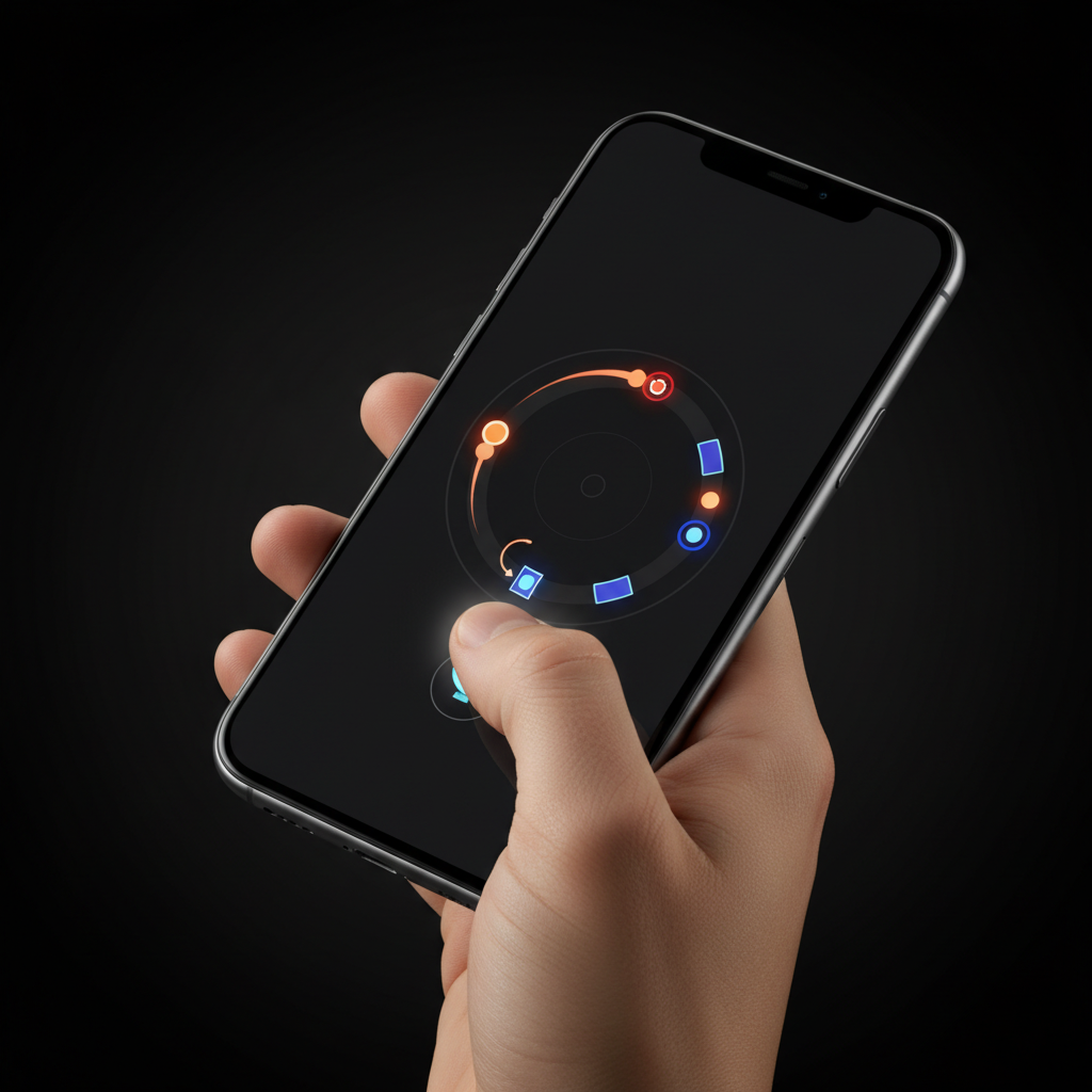
How do you communicate “you are playing against an AI” without resorting to cartoonish robot imagery? The answer lies in visual contrast — making the AI’s presence felt through the aesthetic itself, not through labels or mascots.
Chess platforms like Chessiverse and Maia Chess have taken the opposite approach, humanizing their AI opponents with individual personality portraits, names, and deliberately imperfect play patterns. The goal is approachability: a practice partner, not a threat. That makes sense for chess, where players want a comfortable training experience. But for a game built on the cultural tension between humanity and artificial intelligence — where the whole point is that you are facing the machine — humanizing the opponent drains the drama.
Connection: This connects directly to the psychology research on transparent AI opponents. Making the AI proudly, visibly artificial activates the ego-shield effect — losing hurts less because you can externalize the defeat. And it connects to the sharing research: “I lost to GPT-4o” is a shareable identity statement in a way that “I lost to Bot_47” never will be.
The glitch aesthetic provides a rich visual vocabulary for signaling digital intelligence: chromatic aberration (RGB color channels shifting apart), scan-line artifacts, pixel sorting, data corruption patterns, and procedural visual noise. These techniques carry decades of cultural weight from cyberpunk fiction, where glitches mark the boundary between human and digital worlds. The game Replaced uses this language to explore questions of consciousness through an AI navigating a glitched-out environment.
The most effective approach for competitive play is a dual visual identity. The human player’s side of the experience is warm: organic shapes, natural colors, slight imperfections in line and texture, soft animation curves. The AI’s presence manifests through geometric precision, cool cyan tones, subtle glitch effects on its avatar or moves, mathematically clean patterns. Every interaction becomes visual drama — the organic versus the algorithmic, rendered on screen in real-time. The contrast does not just communicate who is who. It is the aesthetic. The game looks like its own theme.
Most mobile gameplay happens muted. The MDN Web Docs put it bluntly: mobile platforms are “the most difficult platforms to provide web audio support for” while also being “the platforms that people often use to play games.” The game must feel alive with the volume at zero.
Visual rhythm replaces audio rhythm. Screen pulses, color shifts, particle effects, and animated transitions create a sense of tempo and tension that works regardless of mute status. The AI’s “thinking” can be visualized as a geometric pattern that intensifies — faster rotation, brighter glow, tighter fractal detail — creating dramatic tension through movement alone. Victory and defeat need to be rendered as visual events dramatic enough to carry the emotional weight that a score crescendo or defeat chord would normally handle: screen shake, color flash, particle bursts.
The Vibration API (navigator.vibrate()) now enables haptic feedback in browser games, and the WebHaptics library released in 2026 provides cross-framework support for React, Vue, Svelte, and vanilla JavaScript. A subtle vibration when the AI makes its move, when a timer runs low, when the match resolves — these add a physical dimension that works even on mute.
Caveat: Haptic feedback has real limitations. It requires user activation (a genuine tap or click), iOS Safari support remains inconsistent, and device Do-Not-Disturb modes can block vibrations entirely. Haptics should enhance, never carry, the experience.
The design model here is Elden Ring’s “intentionally minimalistic” approach to UI sound: the game works precisely because visual and environmental feedback communicates everything the player needs. For a competitive browser game, this means animation design is not polish — it is infrastructure. How moves appear, how the AI “thinks,” how outcomes resolve on screen: these are the emotional delivery system.
Chicken Road’s sub-5MB payload was not just a performance optimization. It was a distribution strategy. Sixty-eight percent of the game’s sessions originated from India and Brazil, markets where mobile data is metered, Wi-Fi is intermittent, and a 50MB game download is a luxury most players will not pay for. The game’s tiny footprint made it playable on devices and connections that heavier competitors simply could not reach.
This has profound implications for aesthetic choices. Pixel art and geometric abstraction are not just visual styles — they are file-size strategies. A pixel-art character sprite might weigh 2KB where a high-resolution illustration weighs 200KB. Geometric patterns can be generated procedurally with a few lines of code rather than loaded as image assets. The “dual visual identity” approach — warm organic for humans, geometric precision for AI — is not only thematically coherent; the geometric AI side can be rendered almost entirely through code, keeping the payload minimal.
The math reinforces the point. Chicken Road’s cost per install was $0.02, against an industry average of $0.45. That 22x efficiency was not driven by clever marketing. It was driven by a game so small that it could spread anywhere a WhatsApp link could travel, playing instantly on the cheapest Android phone on the slowest 3G connection. Global virality is a bandwidth problem first and a design problem second.
Why this matters: Every aesthetic and technical choice — pixel art over illustration, procedural geometry over loaded assets, progressive loading over upfront delivery — compounds into distribution reach. A 4MB game reaches markets that a 40MB game structurally cannot.
Across six domains of research — cultural sentiment, viral mechanics, competitive psychology, asymmetric game design, sharing architecture, and browser craft — the findings converge on a strikingly specific blueprint. The cultural moment provides the fuel: widespread AI anxiety coexisting with universal AI adoption, a population that wants to feel something about the machines entering their lives. The viral mechanics provide the engine: zero-friction entry, an emotional spike within seconds, a shareable artifact that encodes a species story. The psychology provides the safety net: ego-shielding against defeat, near-miss motivation for retry, collective Team Human framing that transforms individual loss into shared solidarity.
And the browser — the humble, overlooked, infinitely accessible browser — provides the stage. A sub-5MB game that loads in two seconds, teaches itself through its first gesture, plays with one thumb, looks like its own theme (organic humans against geometric machines), feels alive on mute, and produces a moment dramatic enough to screenshot and send to a friend.
The game this research points toward is not hypothetical. It is specific enough to prototype: a real-time arena where human players and AI agents compete under identical rules, visually distinct and proudly asymmetric. The AI does not pretend to be human. The human does not need to understand algorithms. They meet in a shared space, and the outcome — compressed into a cryptic result card, posted to a group chat, decoded only by those who have played — becomes the invitation that starts the cycle again.
The machine is ready. The question is whether you can beat it.